Origins of the Batman Logo
The iconic Batman logo has a unique origin that traces back to the debut of the character. Its initial design set a precedent for the superhero’s brand, serving as a cornerstone of visual identity.
Early Concepts and Designs
Early concepts of Batman logos were simple yet bold. The first iterations featured a basic bat silhouette, reflecting the dark and mysterious nature of the character. With a stark black and white color scheme, these logos captured attention and were easily recognizable. This simplicity ensured the emblem worked well across various media, from comic book panels to merchandise.
Influence of the Original Comics
The original comics had a significant influence on the development of the Batman logo. The character’s creators, Bob Kane and Bill Finger, aimed for a symbol that encapsulated Batman’s nocturnal essence. Thus, the logo often appeared in shadowy environments within the comics, enhancing the vigilante’s lore. Over time, the logo evolved, but it always paid homage to its roots in the classic comics, retaining the bat motif as a constant element. The iconic image of the bat thus continues to be synonymous with Batman, etched into pop culture history.

Design Evolution Through the Decades
The Batman logo has undergone significant changes over the years, reflecting shifts in design trends and the character’s evolving storyline.
Changes from the 1940s to 1960s
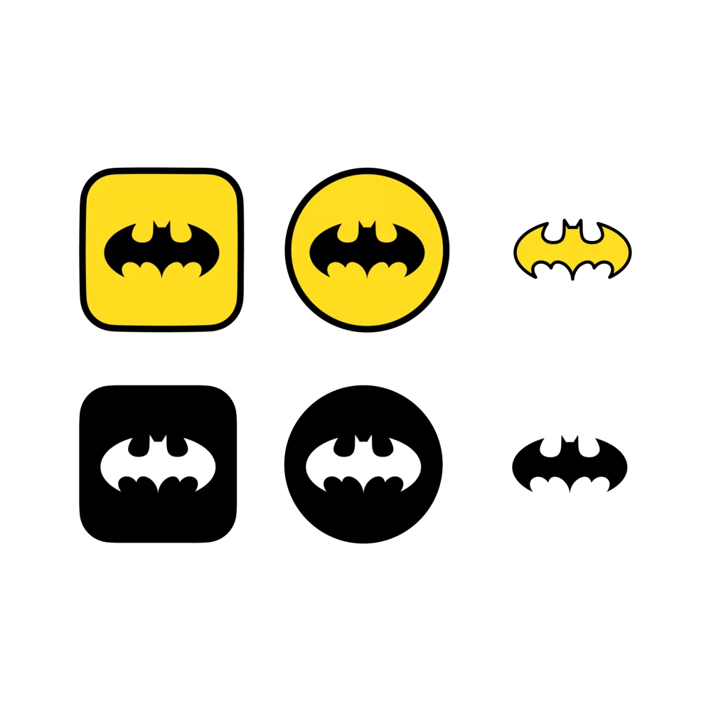
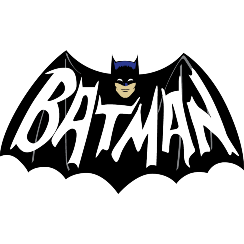
During the 1940s to 1960s, the Batman logo retained its basic bat shape but began to see variations in style and complexity. In the 1940s, the logo featured sharper wing tips, symbolizing a grittier and tougher Batman, aligning with the wartime era. The 1950s introduced a more streamlined bat, with rounded edges and a more dynamic appearance, reflecting the optimism of the era. The 1960s saw the introduction of a yellow oval background, which made the bat symbol stand out more prominently, aligning with the colorful and campy style of the famous Batman TV series of that time.
Modernization in the 1980s and 1990s
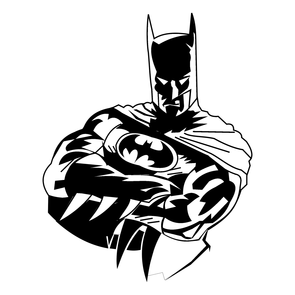
In the 1980s and 1990s, the Batman logo underwent a noticeable modernization. This period introduced a bulkier and more intimidating bat design, mirroring the dark and complex narratives introduced in the comic series and films like Tim Burton’s ‘Batman.’ The background was often black, which highlighted the starkness of the bat emblem. In the 1990s, additional details such as more pronounced bat ears and an angular body made the logo more menacing, reflecting the darker themes of Batman media during this era.
The 2000s to Present Adaptations
From the 2000s onwards, the Batman logo continued to evolve, incorporating sleek, modern lines while remaining true to its iconic silhouette. The adaptations often reflect technological advancements in graphic design, adopting 3D effects and metallic finishes to appeal to contemporary audiences. In recent designs, minimalism has become a trend with the logo being stripped down to its essential elements, making it more adaptable and recognizable across various digital platforms.
Symbolic Meanings Behind the Logos
Representations in Different Eras
Each era’s Batman logo reflects the spirit of its time, symbolizing shifts in societal views and Batman’s character development. In the 1940s, the logo’s sharp edges mirrored a nation at war, portraying Batman as a formidable warrior. The ’50s turned the edges round to mirror post-war optimism, while the ’60s introduced the yellow oval, a nod to pop art and the playful TV series.
By the ’80s and ’90s, the logo’s bolder look echoed a darker, more complex Batman, in tune with that period’s edgier comic narratives and cinema. In contrast, logos from the 2000s to the present focus on minimalist design, encapsulating modernity and technological savvy. This reflects today’s digital age and an adaptable Batman, versatile across various media.
Impact of Logo Changes on Brand Identity
The evolution of Batman logos has significantly influenced the Caped Crusader’s brand identity. Initially, the logo’s simplicity made Batman instantly recognizable. As it evolved, each change preserved the essence of the character, while also redefining his image for new generations.
Changes to the Batman logo also bring about shifts in brand perception. The dark, brooding logos of the ’80s and ’90s strengthened the brand’s appeal to older audiences, favoring psychological complexity over pure heroism. The modern, minimalist designs resonate with an era of sleek, high-tech gadgetry, presenting Batman as a progressive hero that aligns with today’s technology-driven culture.
In summary, the Batman logos are not just visual symbols; they’re historical markers and brand messengers, evolving alongside the iconic superhero they represent.
![]()
Notable Batman Logo Redesigns
Throughout the storied history of Batman, each adaptation brought with it a fresh take on the iconic bat insignia. These redesigns often align with the Dark Knight’s cinematic and animated portrayals, leaving a lasting mark on the franchise’s visual legacy.
Noteworthy Movie Logo Adaptations
Batman’s silver screen appearances have resulted in some of the most memorable logo redesigns. The 1989 ‘Batman’ film, directed by Tim Burton, introduced a logo with a bolder, more dynamic bat set against a yellow oval. This stark design contrasted with the more playful television interpretation and signified a darker tone. Christopher Nolan’s ‘The Dark Knight’ trilogy brought a clean, modern, and angular depiction of the bat, stripping away previous details for a sleeker look that echoed the films’ grounded realism. Each movie logo adaptation not only captivated audiences but also made a significant contribution to the brand’s visual evolution.
Animated Series and Their Unique Logos
Animated series have a vital role in shaping Batman logos. ‘Batman: The Animated Series’ is a prime example, introducing a logo with art deco influences and a bold, red backdrop that stood out from previous iterations. This design captured the timeless yet modern feel of the series. More recent animated adaptations, such as ‘Batman Beyond,’ took a futuristic approach with its red and black logo, featuring a stylized bat that reflected the show’s innovative setting and younger protagonist. These animated logos underline the adaptability of Batman’s image and cater to diverse viewer preferences.
The Role of Technology in Design Changes
The connection between technology and Batman logos is clear and impactful.
Advances in Graphic Design Software
Graphic design software has played a pivotal role in shaping modern Batman logos. Advanced tools enable designers to create intricate details and realistic textures, a leap from the simpler outlines of the past. Software like Adobe Illustrator and Photoshop has given artists the freedom to experiment with shadows, gradients, and 3D effects. This has resulted in more complex and visually striking logos that capture the eye and engage fans.
Creating logos now is faster and more precise. Designers can easily tweak and refine elements, creating perfect curves and sharp edges that were much harder to achieve by hand. The shift to digital has allowed for consistent branding across media, ensuring the Batman logo always looks its best, whether on-screen, in print, or on merchandise.
Digital Influences on Logo Adaptation
Digital media’s rise has significantly impacted Batman logo adaptations. With screens dominating, logos need to be versatile – clear and recognizable, even when scaled down for mobile devices. As a result, recent logo designs often feature strong, clean lines and a more minimalist appeal that translates well digitally.
Social media and online marketing have also influenced logo design. Logos must now be striking enough to stand out in a fast-paced, scroll-heavy environment. They’re not just symbols; they’re part of a larger digital conversation. The adaptability of the Batman logo to these environments reflects the character’s timeless appeal and the brand’s dedication to staying current.
Cultural Impact of the Batman Logos
The Batman logos have not merely been symbols; they’ve perpetuated a vast cultural impact. Over decades, these evolving emblems have transcended their origins to become crucial cultural artifacts.
Fan Reception and Cultural Significance
Batman logos resonate deeply with fans, encapsulating the essence of the character and the era he represents. Each evolution of the logo sparks discussions among enthusiasts and critics alike, highlighting its role as more than a mere graphic. It’s a topic of fan debates, with collectors seeking out merchandise with specific logo variants, symbolizing pivotal points in Batman’s story. Moreover, specialty exhibitions and documentaries often explore the graphic history of these logos, emphasizing their cultural weight.
Merchandising and Commercial Use
Commercially, Batman logos are omnipresent. They appear on a myriad of products, from T-shirts and caps to more high-end collectibles like watches and art pieces. Each item not only promotes Batman as a brand but also celebrates different phases of his iconic visual journey. The commercial use of these logos demonstrates their vast appeal and ensures Batman remains a prominent figure in popular culture. Their usage in advertising also underscores their importance in not just comic merchandise but in broader, mainstream brand strategies.

Comparing Batman Logos with Other Superhero Logos
The Batman logo stands apart in the realm of superhero emblems. Yet, it shares some commonalities with others, such as the use of distinctive and meaningful symbols. These symbols often convey each hero’s core attributes or powers. The easily recognizable bat silhouette is similar to Superman’s ‘S’ or Spider-Man’s spider emblem in its simplicity and impact. However, the Batman logo’s evolution and adaptability, varying from intricate to minimalistic across different eras, set it distinctively apart from other more static designs.
Similarities and Differences
Comparing Batman logos with those of other superheroes uncovers both similarities and differences. Most superhero logos aim to be instantly identifiable, reflecting the hero’s persona and storyline. Like Batman, many characters have gone through logo redesigns that symbolize their growth and changing times. For instance, the Flash’s lightning bolt has remained consistent in concept but altered in style, much like the bat emblem. On the other hand, Batman logos often embody a darker aesthetic, reflecting the character’s brooding nature, which is less common in the typically bright and hopeful emblems of his counterparts.
Influence on the Superhero Genre
The influence of Batman logos extends beyond their visual appeal. They have helped shape the superhero genre itself. The iconic nature of these logos encourages a branding strategy that other franchises have followed, making logos integral to a hero’s identity. Batman’s logo evolution has also signaled to other franchises the importance of adapting their symbols to stay relevant in a changing cultural landscape. As Batman logos continue to inspire and reflect the character’s legacy, they also set a benchmark for design excellence within the superhero genre.


